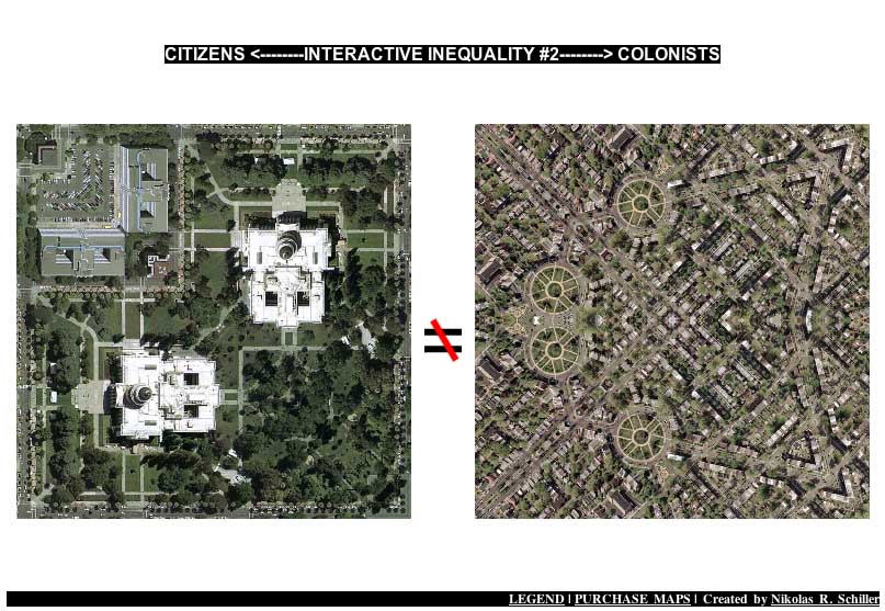
Screen shot below features Sacramento Quilt & Grant Circle Quilt
When I created the first “Interactive Inequality” I did not have the folder structure created properly to retrieve the desired maps. The colonial side was pulling all the Zooms and the Details (Total: 266) and the represented side was pulling only the Zoom Outs (Total: 147). What made this unique was that the American side would always feature a geometry and the DC side would sometimes feature a non-geometric Detail making the inequality more pronounced.
This new version reflects the new folder structure perfectly. The side that features places where people have two senators and one representative will now feature only their map’s Details (Total: 280) and the side that shows places where second-class citizens reside will also features only the Details (Total: 144). Unlike the Zooms, which I created standardized scripts for, I never followed a specific pattern when making the Details. All I would do was look for a spot on the map that appeared interesting and I would then cut & paste that copied portion into a new page and then reduce it to 800×800 in size. If I would copy a portion that was under 800×800 I would try again. Thus some show a lot of scaling, others show very close-up detailed views of the two different Americas that exist today.
Number of Visual Combinations:
280 * 144 = 40,320
Or as I’d rather put it: 40,320 questions related to how democracy can be brought to Baghdad but denied to the 570,000+ residents in Washington, DC?


