The Daily Render

by

A Digital Scrapbook for the Past, Present, and Future

| FRONT PAGE | GEOSPATIAL ART | DC HISTORY / TIMELINE | NEWS | COLONIST | FOUND MAPS | FRACTALS |
| PHOTOGRAPHY | ANTIQUE | DESIGN | VIDEO | | CONTACT |

A New Strategy For Full Representation in Congress: Have the District of Columbia Government Sue State Legislatures
|| 7/14/2010 || 2:54 pm || + Render A Comment || ||

Last night I received an e-mail from Timothy Cooper, executive director of World Rights, about his recent appearance on NewsChannel 8 and decided to save the video to publish here. The thrust of the new strategy is to have the District government sue the State legislatures around the United States for denying District residents full representation in Congress using international law as the basis for this lawsuit. The strategy is quite novel and I’m curious to see how this turns out.


The Modern Geographer is featured in Pro-Prosições vol.20 no.3 Campinas Sept./Dec. 2009
|| 2/25/2010 || 2:18 pm || + Render A Comment || ||

On April 1st, 2009 I received an e-mail the author Jorn Seemann, a graduate student at Lousiana State University, requesting to use my piece “The Modern Geographer” in an upcoming peer-reviewed article for the 10-year-anniversary issue of the Brazilian journal Pre-Posicoes (Universidade Estadual de Campinas, UNICAMP). I was expecting to have to send him a larger version of the work, but to my chagrin the on-line version was able to work for publication.


O quadro O geógrafo não é apenas um objeto perfeito para uma leitura geográfica de imagens, mas também uma fonte quase inesgotável de inspiração para discutir o passado, o presente e o futuro da geografia. A composição de cores, objetos e sombras abre espaço para interpretações múltiplas. Provavelmente nenhuma delas corresponderia ao que Vermeer tinha pensado quando pintava o quadro. O significado original pode perder-se no decorrer do tempo, mas isso não invalida as nossas ponderações. De forma semelhante às iniciativas dos geógrafos de desconstruir os mapas, as obras de arte também podem ser re-significadas como “meios de encontrar [finding] e depois criar [founding] novos projetos, efetivamente re-formando o que já existe.” (Corner, 1999, p. 224). Um exemplo do presente é o Geógrafo moderno, de Nikolas Schiller (Figura 8), que mostra clones do geógrafo cercando uma mulher cujo corpo é uma estampa de fotos aéreas de Washington, DC.


I will have an English translation on-line shortly…..



Suggested Revisions to the “Legalization of Marijuana for Medical Treatment Initiative Amendment Act of 2010” by the Washington, DC Chapter of Americans For Safe Access
|| 2/21/2010 || 2:16 pm || 2 Comments Rendered || ||

Earlier this month I, along with 10 other District residents, founded the Washington, DC Chapter of Americans For Safe Access, which is America’s largest patient advocacy organization with over 50,000 members. Since Congress had prevented Initiative 59 from becoming law for so long, there has never been the opportunity for the local chapter to form. Over the last couple weeks we’ve met a few times and have deconstructed the amendments to Initiative 59. Below is the official position of the Washington, DC ASA Chapter concerning the amendments:

+ MORE


The 2008 Washington, DC Orthophotography
|| 10/21/2009 || 4:30 pm || 1 Comment Rendered || ||

Screen grab from https://www.nikolasschiller.com/blog/wp-admin/post-new.phpGraphic Converter showing the entire dataset of the 2008 Washington, DC Orthophotography

A couple weeks ago when I was writing the entry about crime in my neighborhood, I discovered that the DC Government’s Citizen Atlas was using aerial orthophotography taken in 2008. I subsequently checked the USGS website to see if they had obtained the dataset, but they were still using the imagery taken in 2005. I decided to e-mail one of my contacts in the Office of the Chief Technology Officer. I asked if the dataset was available to the public or if it was going to be ported over to the USGS’s distribution system, and to my chagrin, the offer was extended to mail me a copy of the entire dataset. About a week later I received the CD in the mail and today I started to explore all the brand new imagery that I now have at my disposal! I now have the ability to use aerial orthophotography of Washington, DC taken in 2002, 2005, and 2008.

I first must note that the roughly 67 gigs worth of aerial orthophotography of Washington, DC was all compressed using the Mr. SID file format and was able fit on one CD-Rom. While that level of digital compression is pretty insane (80 to 1), I still have my reservations about it. Almost two years ago I wrote about how Mr. SID has been the bane of my cartographic explorations, and well, not much has changed since then. There is still only one software program for Macintosh that I am aware of that allows users to uncompress the imagery locked away in the proprietary file format, GraphicConverter X for PowerPC-Macs.

Worse, I am having difficulty extracting the imagery that I want to use! The screen grab above shows the selection screen that pops up after I open the Mr. SID file containing the 2008 Washington, DC orthophotography. At first I was really excited that I could quickly and easily draw a box around the portion of the city I wanted to extract. However, after testing it out, I found that there is some latent bug in either the program or the file.

After I draw a box around the area I wish to extract, Graphic Converter spends a few moments decompressing the portion of the file, then it opens up the imagery. There is just one catch: the box I draw does not correspond to the imagery that opens up! For example, if I draw a box around the White House, a few moments later I am looking at imagery from Woodley Park neighborhood. After experimenting for about an hour, I discovered that the imagery is being extracted from somewhere northwest of where I am selecting. This is frustrating to say the least! Instead of quickly and easily obtaining the exact imagery that I want, I now have to do a series of trial & error selections in order to obtain exactly what I am looking for.

Moreover, due the level of compression used in Mr. SID, the uncompressed imagery contains small artifacts that diminish the overall quality of the original aerial orthophotography. To visualize this, imagine for a second that you decided to save a photograph using JPEG compression, but instead of selecting a high number (less compression) you select a very low number (high compression). When you look at the file that you saved, you can see little bits of digital static in the image. These artifacts are the result of high levels of digital compression in the Mr. SID file (80 to 1) and while its not excessive, it is present. I prefer uncompressed TIFFs because they generally look better.

The only way I’ve figure out how to reduce this annoyance is to actually reduce the size of the source aerial photography and in doing so, I’m reducing the overall spatial resolution of the original aerial photography. Released at approximately 15 centimeters per pixel, the imagery is so sharp that you can see people walking on the ground and be able to identify types of cars, but any reduction in size results in less precision and detail.

Nonetheless, I am very excited to start making more maps of Washignton, DC using the 2008 imagery! I look forward to exploring the nuances in development that have taken place over the years. I am also very appreciative of the DC GIS Program for providing me the new imagery free of charge. Thank You!


Violent Crime In My Neighborhood Has Increased Over 100% in the Last Year
|| 9/22/2009 || 1:43 pm || 1 Comment Rendered || ||

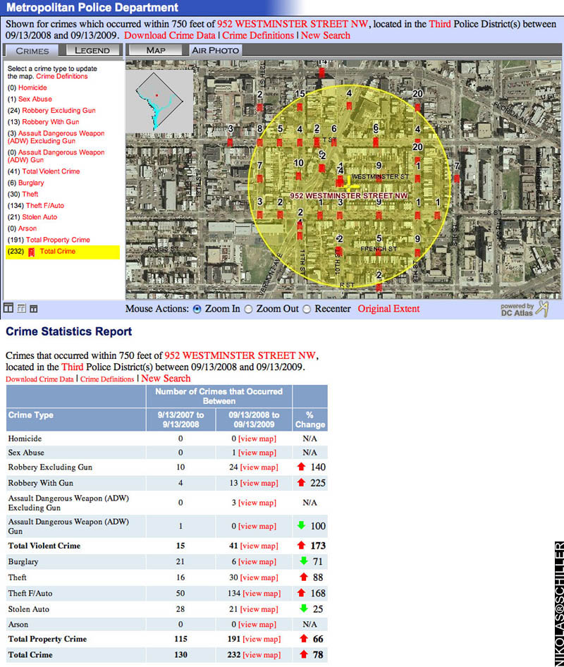
Last week my City Councilmember, Jim Graham, sent an e-mail about the drop in crime over the last 30 days to my neighborhood association listserv and included various local government officials like the DC Police Chief, Cathy Lanier. The e-mail featured two graphs of data from DC’s Crime Map that covered the police service area of my neighborhood and showed the crime statistics of August to September of 2008 compared to August to September of 2009. What the graph lacked, however, was the hyperlocal angle of the crime taking place in the immediate vicinity of the block that we live on and the larger picture showing the other 11 months of crime data.

As a two-time victim of violent crime last year in my neighborhood, on my front doorstep & at the end of the block, I was fully aware that the data in the graphs included me, so I felt compelled to use the very same tool my councilmember used to analyze the extent of the crimes that have recently taken place. The result genuinely stunned me and I proceeded to respond to his e-mail (text below) with the two maps (above & below) that show the various crimes that have taken place in my neighborhood.

+ MORE


Removal of the Competitive Ad Filter [Selling Out Part Two]
|| 9/17/2009 || 11:34 pm || 2 Comments Rendered || ||

My previous entry about seeing an advertisement related the very organization I was mocking struck a chord with me. Why fight the tide? As in, why take issue with competing ideas?

Since I added Google AdSense earlier this year, every time I found an advertisement that I didn’t want showing on my website, I would log on to Google AdSense, and add the URL to my Competitive Ad Filter. But who was I competing against? Were the ads merely competing against my own ideology?

Was I saying, “Hey Nikolas, you don’t want your visitors to think you tacitly support [insert company]?” or “Do I want some organization that advocates beliefs contrary to my own showing up here?” And I came to a two-fold realization….

First, by limiting the competition for ads on my website, I was earning less money each time someone clicked on an ad. The way Google AdSense works is that companies bid on keywords and these keywords are triggered by content on my website. When there is less competition for these keywords, other companies pay less for the ads to show up on my website. So why earn less, when I could just as easily remove ALL the ads entirely? Why continue to log into AdSense and add to the Competitive Ad Filter each time I found an ad contrary to my ideology? I began to view this practice as a futile effort, akin to swimming in quicksand.

Second, I actually enjoy seeing something different each time I view my blog. As someone who has spent years compiling this content, I know exactly what I am going to see (within a certain degree) every time I visit. But the ads are somewhat random and this makes the experience more engaging on my end (and maybe yours as well?). I can’t say the same for those people who happen to stumble upon my website for the first time and think they look tacky (sorry!). But I can say that they bring a certain amount of personal entertainment that goes beyond the authorship of this content. They show who is paying for words— and words retain a certain degree of power. Thus I can see who was fighting and winning the war of words right on the top of my website– in real time.


Earlier today I removed all of the websites that I was blocking in my Competitive Ad Filter. As the title of this entry suggests, I have, to some degree, completely sold out. The Part One related to the title of this entry is about the removal of the robots exclusion protocol that blocked web crawlers from accessing the content of my website a year & a half ago. By selling out then, I began a radically new direction (paradoxically, a direction most people automatically start at) and this entry highlights a subtle change of course. The moment I opened the floodgates to web crawlers, every personal opinion, every word, every image, every map, EVERYTHING that I had spent years creating and documenting was placed within reach of a simple google query. Before that moment, it was reserved only to those who knew me or knew of me. While this might seam contrary to the nature of the internet, I did it all on purpose and I have zero regret.

Nonetheless, as Part Two begins manifests itself, I expect to see more ads that go against my ideology, but now I fully welcome them. I welcome these contrasting viewpoints in order to strengthen my own. And maybe, just maybe, earn a few bucks to pay for my hosting and domain names.


Dear WashingtonPost.com: Either You Are Censoring Bloggers Or Your 3rd Party Widget Isn’t Working Properly
|| 8/18/2009 || 4:25 pm || 5 Comments Rendered || ||

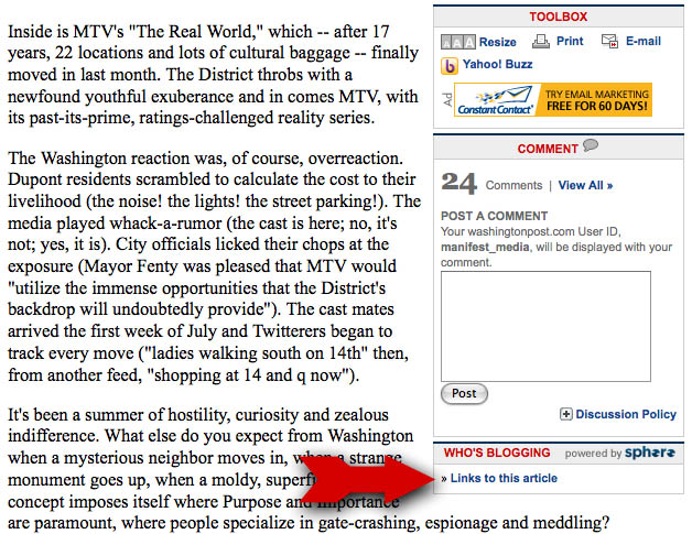
Screen grab from the Washington Post article on the Real World highlighting the link that is supposed to show who is blogging about the article you are reading

On Sunday I was pleased to see that Washington Post staff writer Dan Zak had transcribed my poster in his article on MTV’s Real World filming in DC. So pleased in fact, that I spent about an hour writing and formatting a blog entry about the article.

Fast forward to this afternoon. I decided to go back to the article to see what kind of reaction Dan Zak’s article made on-line. The metrics for ascertaining this information is somewhat straightforward; the more comments the article generates, the larger the reaction. This, however, only gives the basic information of who decided to comment on the Washington Post website. The second metric that can be used to gauge the popularity of an article is to see who is blogging about it.

Since the Washington Post’s print edition does not make it’s way out of the District of Columbia, Maryland, and Virginia to other parts of the United States and the rest of the world, bloggers are an integral part of the Washington Post’s digital distribution model. As a way to track this digital diaspora of off-site responses to an article, the WashingtonPost.com has a link posted in each article that is supposed to show who is blogging about the article you are reading (see red arrow above). This link is managed, err, powered by a third party called Sphere, which is supposed to track instances of when bloggers use the URL of a specific article in their blog entry.

Screen grab from the Washington Post article on the Real World questioning why my blog entry does not appear in the listing of who is blogging about a article

So why wasn’t my blog entry mentioned? Does this third party widget not work as well as it should? Are the 206,000 websites that Sphere.com says are using their product not really getting the best product they thought they were receiving? Or is there some form of censorship that is being employed at the Washington Post to scrub out blogs that the web editors don’t want their readers to see?

In my opinion, I think Sphere.com is not working to the best of it’s theoretical ability. I say this because I would rather not think there is some sort of censorship taking place– but I will not rule that prospect out. In my original blog entry I made sure that I hyperlinked to the article, used the entire name of the article, included the name of the author, and I even sent a trackback to the URL on the WashingtonPost.com. Combined together, all of these factors should have put my entry in the “Who’s Blogging” listing. But, alas, its not.

This has some important implications. First and foremost, the author of the article is not able to fully see the extent to which his article was covered on-line. His boss might incorrectly assume by reading the Sphere.com information that the article had minimal on-line reaction and possibly make future editorial decisions based on this partial & incomplete information. Secondly, WashingtonPost.com readers are unable to see other opinions about the article. Instead they are only offered the opinions written by other WashingtonPost.com readers (which I’ve griped about before) and not writers who have their own established blog and dedicated readership. Lastly, since I was not given credit for writing the sign transcribed in the article, I was further excluded from receiving any residual credit, and the WashingtonPost.com readers were never informed of why the sign was put up in the first place.

In conclusion, I hope the WashingtonPost.com and/or Sphere.com fix this widget or refrain from this type of subtle censorship. This exclusion of other viewpoints only hurts their readership and stifles subsequent information discovery. My opinions are just as valid as those expressed by the commenters on WashingtonPost.com and its disingenuous to present a link that appears to give accurate information about who is blogging about an article, when it’s clearly not showing all the bloggers who took the time to participate in the discussion.


The Infinite E-mail – An Artistic Potential Security Flaw in Apple’s Mail Application [Inbox Art]
|| 8/12/2009 || 1:53 pm || + Render A Comment || ||

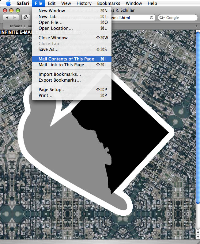
A screen grab showing the Safari browser option of e-mailing a webpage

Imagine that every time you clicked on an e-mail in your inbox, the e-mail showed something different. Well thats what I discovered last night before I went to bed.

A few weeks ago I found out that Mac users can send fully coded HTML e-mails using Apple’s Mail Application. All one needs to do is open up Safari, go to the page you want to e-mail, and select “Mail Contents of This Page” in the File Menu (see image above). The contents of the page are then automatically pasted into an e-mail that is ready to be sent:

A screen grab showing the HTML in an e-mail

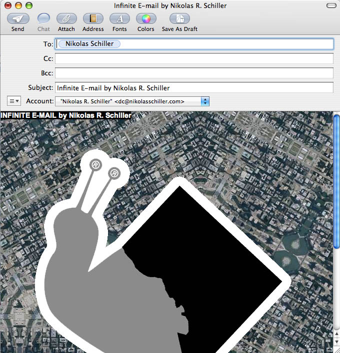
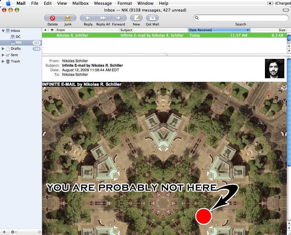
But what if the HTML contains PHP scripts that dynamically load content? The HTML (originally from the Grand Juxtaposition via the front page of my website) calls two PHP scripts that randomly selects two images from two different folders on my website. So when you click on the e-mail in your inbox, two new images are displayed because Apple’s Mail Application runs the PHP scripts:

A screen grab from Apple's Mail Application showing a different image in the body of the e-mail because the PHP scripts

Notice that the images in the e-mail are different than what was originally sent
Click to view the full-sized image

Lets say the script was malicious and called a website that attempted to download malware. Would this ‘discovery’ be a flaw in Apple’s Mail Application?


So far I have tested this splendid e-mail out by emailing myself the same page to my GMail, Yahoo Mail, and MSN e-mail accounts. With the exception of MSN, which only loaded the foreground graphic and not the background graphic, neither GMail nor Yahoo worked like Apple’s Mail Application. I have not tested it out on Entourage or any other off-line e-mail client programs and I am curious if they’ll run the scripts or not. Regardless, this is probably one of the coolest e-mails ever!


Related Lost Series Entries:

+ MORE


Dreaming of being on the Metro then one hour & seventeen minutes later a Metro train crashes
|| 6/22/2009 || 10:29 pm || + Render A Comment || ||

So around 3:30pm I awoke from my afternoon nap and Twittered that I had two vivid dreams at 3:45pm. About an hour and seventeen minutes after I posted that, while I was sitting on my front porch reading today’s paper, the worst train crash in the history of Metro took place. This type of dream prescience has happened before, so before the dream goes into the deep recesses of my memory, I am going to briefly transcribe what I remember. The following recollection was written at shortly after 6:05pm on June 22nd:

The dream started out inside of a train that looked and felt like a Metro train traveling at somewhat high speeds. However it seemed to be moving faster than normal, or maybe that was just the nature of the dream. Behind me was what looked like an airline pilot and a lady in a business suit. We were talking about how it was nice to be traveling on the train and then the conversation made its way to Accela. Where I turned around and said, “But it still uses the same rail lines as the regular trains.” They both laughed and then the train went completely silent as we rolled on. The silence reminded me of when I am on the Metro and the AC goes off and this audible static goes away for a brief moment. As we roll on down the track in silence this portion of the dream ends….

I then found myself floating above Nationals Stadium. A batter has hit a baseball deep into the outfield. Instead of a normal wall, there a crowd of teenagers who are in the field with baseball mitts and one of them catches the ball and then the crowd of teenagers disperses. No once can see who took the baseball. Then the crowd of the stadium starts to sing in unison to the tune of “Happy Birthday To You,” a phrase that causes those in the stadium to break out in laughter, “Where is the baseball, Where is the baseball, Where IS the baseballllll, Where is the baseball?” Shortly after this scene the dream ends.

I found it interesting that my mind had created something both funny and completely new in the context that I tend to think of dreams as a subconcious means of rehashing ideas and visions that have taken place in my waking life. Every part of the train sequence was rehashed from experiences of being on Metro and Accela trains, but the baseball portion was different. I have never created a somewhat humorous song while sleeping. However, its the train portion of the dream that is still haunting me.


UPDATE: To make matters more eerie, it turns out that two of the fatalities in the train actually resemble the two people I was talking to on the train in my dream. The pilot who died, Maj. Gen. David F. Wherley Jr., was involved in protecting Washington, DC during the whack events on 9/11, which is the source of my previous dream and he was sitting next to his wife, who also died. I got a chill down my spine after looking at their photos. However, unlike my dream, we were all sitting in the back of the train, not the front where they were actually sitting. I specifically remember turning around to speak with them because they were behind me and from my experiences on Metro trains the seats at the end of the car tend face the direction of the trains movement. Moreover, the lead cars, where the conductor is located and where they were sitting, have fewer seats than the back of the train. Regardless, I’m still a bit shaken by this synchronicity.


Analyzing my Facebook friends social behavior through Google Reader
|| 6/17/2009 || 3:16 pm || + Render A Comment || ||

I haven’t written about Facebook since I created the group “Washington Metropolitan Area Residents for a 24 Hour Metro” back in February. Previous to that, the entries were related to my experiments using their internal advertising system (Part 1, Part 2, Part 3, Part 4) and prior to that, I briefly wrote about the Nexus application that shows the relationships & commonalities of my Facebook friends. Back in March of 2008, I had a little under 400 friends and since then I have gained over 600 new friends and now have a little more than 1,000 Facebook friends and they share a lot links.

A few months ago I discovered that I could subscribe to my friend’s shared links on Facebook through an RSS reader. I was attempting develop a means to synch up what I shared on Facebook with what I shared on this website and found that I could subscribe to what all my friends were sharing on Facebook. I had come to the conclusion that it was easier to share information through the Facebook platform than through this blog and I wanted to find a way that my shared links would show up here using my Daily Links concept. While I ultimately abandoned the effort (as well as the Daily Links concept), I kept my subscription active in Google Reader.

Today I decided to check out the statistics related to my Facebook friends shared link RSS feed. What I found was quite interesting….


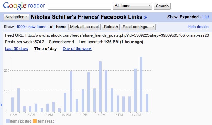
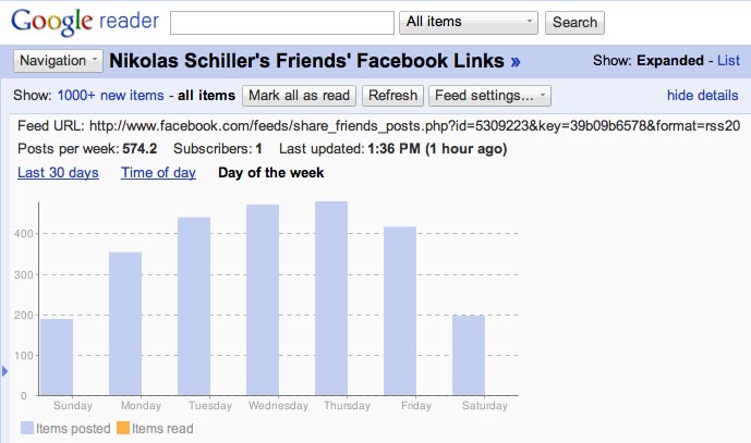
The average links shared per week is a little over 574 “posts” (posts are technically individually shared links) and with a little over 1,000 friends, this would statistically translate to half of my friends share one link a week. However, from my experience, I would say that its probably 10% to 25% of my friends are active users who share links often and the rest are passive users or don’t use Facebook that much. To reach the number of 574 shared links per week, then in the last 30 days there was roughly 2300 links shared during the month (574 posts per week x 4 weeks = 2296.8 links per month), which translates to a little over 2 links per person per month. As far as the shape of the graph goes, like the traffic on this website, there is a seemingly up & down flow that I’ve found to correlate to how most people use the internet during the week and not using it during the weekend.

This screen grab shows something I wasn’t expecting. The time of day in which my friends share their links does not completely correlate to my initial notion that most people share links on Facebook only while at work. Instead the times in which my friends share the most links are around 10pm & 11pm at night; probably before they go to bed. However, judging by the 4pm & 5pm spikes in the number of shared links, I can deduce that people are sharing links more at the end of the work day than at the beginning. The spike at around 11am in the morning might indicate that people are using Facebook during their lunch break. In all, I think this graph is the most telling of the Facebook usage of my friends on-line social behavior.

Finally, this screen grab also shows shows the which day of the week my friends share the most links. This graph mimics the undulation shown on the Last 30 Days graphic above. Interestingly, Thursday edges out Wednesday as the most popular day and Tuesday is more popular than Friday. I personally expected Friday to be the day that the most links are share because in my experience it was the day of the week that required the least amount of work. At below 200 links, nearly half the amount for the other five days of the week, I was not surprised by the low number of links shared on the weekends. As I stated before, this mimics the traffic this website.


In summary, I find this type of information very interesting. I don’t think its that useful information for everyone because it only shows the on-line social behavior of my friends. Moreover, this information does not fully paint the entire picture of my friends Facebook usage. Status updates, uploaded photos, uploaded videos, and those stupid quizzes are not shown in these graphs; only the number of links that are being shared. However, I believe there are some general concepts that can possibly be extrapolated if you were to subscribe to your friend’s shared links.


The Daily Render By
A Digital Scrapbook for the Past, Present, and Future.

©2004-2023 Nikolas R. Schiller - Colonist of the District of Columbia - Privacy Policy - Fair Use - RSS - Contact


::LAST 51 POSTS::

Fair Use


47 queries. 3.102 seconds.
Powered by WordPress

Photo by Charlie McCormick
Nikolas Schiller is a second-class American citizen living in America's last colony, Washington, DC. This blog is my on-line repository of what I have created or found on-line since May of 2004. If you have any questions or comments, please contact:

If you would like to use content found here, please consult my Fair Use page.

::THE QUILT PROJECTION::

Square
Square

Diamond
diamond

Hexagon
hexagon

Octagon
octagon

Dodecagon
Dodecagon

Beyond
beyond

::OTHER PROJECTIONS::

The Lenz Project
Lenz

Mandala Project
Mandala

The Star Series


Abstract Series
abstract

Memory Series
Memory

Mother Earth Series
Mother Earth

Misc Renderings
Misc

::POPULAR MAPS::

- The Los Angeles Interchanges Series
- The Lost Series
- Terra Fermi
- Antique Map Mashups
- Google StreetView I.E.D.
- LOLmaps
- The Inaugural Map
- The Shanghai Map
- Ball of Destruction
- The Lenz Project - Maps at the Library of Congress
- Winner of the Everywhere Man Award

::MONTHLY ARCHIVES::


::LOCATIONS & CATEGORIES::

  • 2004 Elections (2)
  • 2008 Elections (35)
  • 2014 Elections (4)
  • 2016 Elections (2)
  • ACLU (3)
  • Activism (287)
  • Adbusters (13)
  • Advertisements (33)
  • aerial photography (19)
  • Analysis (31)
  • Animals (30)
  • animated gif (7)
  • Animation (25)
  • Antique (104)
  • Apple (1)
  • Arabic (17)
  • Architectural Archeology (9)
  • Artomatic (25)
  • Astronomy (15)
  • Astrophotography (9)
  • Audio (2)
  • Awards (3)
  • Backpacking (2)
  • banner graphics (5)
  • Beat Google to the Map (56)
  • bicycle (23)
  • Birds-Eye View (5)
  • Blaeu (10)
  • Book Covers (7)
  • Bridge (10)
  • Building (15)
  • calendar (28)
  • calligraphy (6)
  • Capital (61)
  • Cars (18)
  • Cartography (74)
  • Cartoon (9)
  • Celestial (31)
  • Censorship (32)
  • Chinese (7)
  • Chronicling America (34)
  • Classroom (5)
  • Clothing (12)
  • Commentary (76)
  • Commissioned (27)
  • Credit Cards (3)
  • Crime (12)
  • Cyrillic Alphabet (1)
  • DAILY LINKS (30)
  • Dance (2)
  • DC History (93)
  • Design (102)
  • Digital Scrap (5)
  • Election (11)
  • ESA (3)
  • Facebook (19)
  • Fantasy (3)
  • Fashion (23)
  • Fast Food (2)
  • FBI (7)
  • Flag (15)
  • flickr (4)
  • Found Map (56)
  • French (9)
  • Gallery (54)
  • Gardening (25)
  • General (256)
  • George Bush (12)
  • GIS (69)
  • GMO Labeling (4)
  • Google (31)
  • Google AdSense (4)
  • Google AdWords (3)
  • Google Earth (28)
  • Google Maps (47)
  • Google Reader (4)
  • Google Streetview (8)
  • GPS (7)
  • Graffiti (5)
  • Greek (4)
  • Green (72)
  • Green Party (18)
  • Healthcare (15)
  • Highway (35)
  • Hiking (2)
  • Hipster (2)
  • history (151)
  • Holidays (10)
  • House Party (2)
  • Hubble Telescope (2)
  • Humor (88)
  • In The News (88)
  • Insects (2)
  • Interactive (74)
  • Interiors (4)
  • IP Trace (28)
  • Latin (22)
  • Law (15)
  • Lecture (11)
  • Legislation (19)
  • Library (21)
  • Library of Congress (66)
  • Location (1,018)
  • LOLMaps (3)
  • Mass Transit (6)
  • Memorandum (2)
  • meta-data (32)
  • Mobile Phone Applications (1)
  • Movie (3)
  • MrSID (4)
  • MSN (5)
  • Museum (5)
  • Music (48)
  • MySpace (6)
  • NASA (10)
  • National Archives (3)
  • News (182)
  • Obituary (2)
  • Oil (4)
  • Ornithology (4)
  • orthophotography (4)
  • OSCE (16)
  • Photography (134)
  • Poetry (18)
  • Portuguese (1)
  • postmodern (8)
  • QR code (9)
  • QTVR (4)
  • Radio (3)
  • Renderings (675)
  • RSS (3)
  • Seasons (12)
  • Sold (40)
  • Spanish (7)
  • Speech (5)
  • Sports (1)
  • Stadium (40)
  • statehood (94)
  • Statistics (2)
  • Stellarium (4)
  • Stereogram (1)
  • Street (21)
  • Street Art (10)
  • Submissions (5)
  • Tattoo (2)
  • Testimony (2)
  • time-lapse (19)
  • Torture (3)
  • Transportation (6)
  • TV (23)
  • Twitter (5)
  • University (41)
  • Update (24)
  • Vegetarianism (2)
  • Video (49)
  • Vimeo (18)
  • visualization (36)
  • Washington Critic (2)
  • Weather (19)
  • Web Crawler (9)
  • Wikipedia (14)
  • Wordpress (4)
  • Wordpress Upgrade (2)
  • World Wind (3)
  • Yahoo (6)
  • YouTube (113)
  • Zodiac (23)


  • thank you,
    come again!