I found this map posted inside a bus stop in Adams Morgan last week.

| FRONT PAGE |
GEOSPATIAL ART |
DC HISTORY / TIMELINE |
NEWS |
COLONIST |
FOUND MAPS |
FRACTALS |
|
PHOTOGRAPHY |
ANTIQUE |
DESIGN |
VIDEO |
|
CONTACT |
[FOUND MAP] 50+ Yard Sales in Adams Morgan
|| 5/25/2011 || 4:10 pm || Comments Off on [FOUND MAP] 50+ Yard Sales in Adams Morgan || ||
[FOUND MAP] The Lining of a Leather Jacket
|| 3/13/2011 || 4:11 pm || 1 Comment Rendered || ||
[Found Map] The 3rd District Police Station in Washington, DC
|| 12/16/2009 || 9:20 pm || Comments Off on [Found Map] The 3rd District Police Station in Washington, DC || ||

Over the holidays I’ve had friend’s come and visit me. When they drive to Washington, DC, I always go to the police station to get my guests temporary parking permits. Two weeks ago I noticed this display on the opposite side of the station and decided to snap a couple photos. I don’t know who designed the display, but think the juxtaposition of the photographs on the map was interesting. What this map does lack, interestingly, is a little red dot that says you are here. The photograph and the map has no geovisual correlation because the map makes no reference to the location of the Third District Police Station. Is it possible that the layout was generic and the detail photograph was inserted for each of the different police departments? I have not been to any other stations, so I don’t know if the police in 2D are as lucky as 3D. I like the display, I just wish there was a better geographic connection embodied within it. I could add one. Maybe I should. A bonus would be the map of where Zone 1 and Zone 2 parking permits are allowed. I’ve asked officers present if they had one they could show me and they’ve never had one. This important boundary map helps ensure all citizens are given the appropriate Zone to park in. Thankfully I live in a permeable boundary that allows both Zones, but what if you live in an area that is one Zone only and you happen to get the wrong one and your guest gets a $100 ticket? Not fun.

Found Propaganda Map From The Oromo Liberation Front
|| 11/28/2009 || 1:39 pm || 4 Comments Rendered || ||

I was looking on Google Maps to see what businesses had been listed on their newly updated maps. To my surprise, I found that at the end of my block is the Washington, DC office of the Oromo Liberation Front.
The Oromo Liberation Front, or OLF, is an organization established in 1973 by Oromo nationalists to promote self-determination for the Oromo people against what they call “Abyssinian colonial rule“. It has been designated a terrorist organization by the Ethiopian government, but I have been unable to find what the United States Department of State considers this organization. Aside from an office down the alley from me in Washington, D.C., they also operate an office in Berlin where their Amharic and Afan Oromo radio stations broadcast.

+ MORE
My Accidental Geography Submission “Gingerbread DC” Was Featured Today on StrangeMaps
|| 11/23/2009 || 7:12 pm || Comments Off on My Accidental Geography Submission “Gingerbread DC” Was Featured Today on StrangeMaps || ||
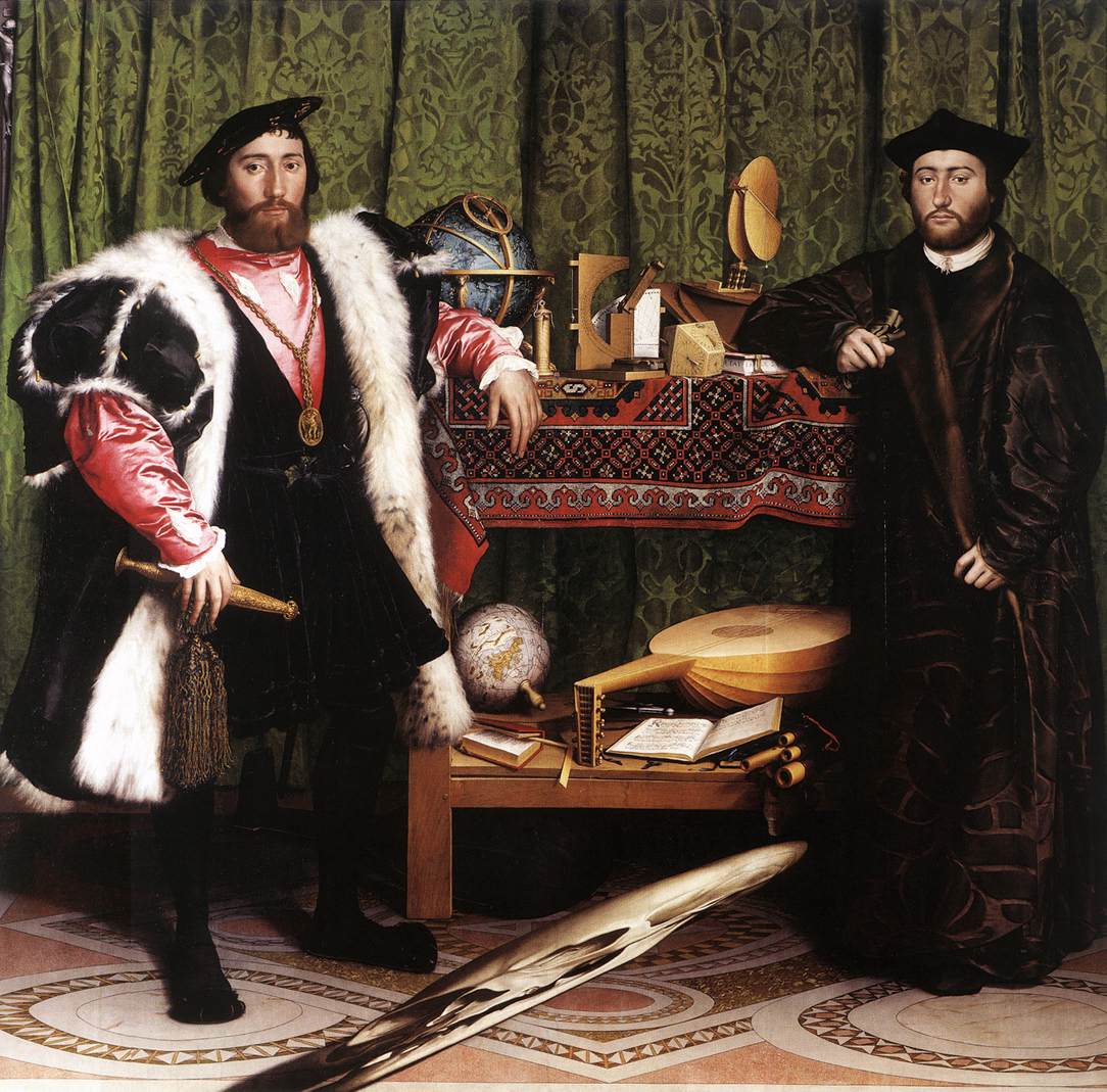
[FOUND MAP] The Ambassadors by Hans Holbein, The Younger (1533)
|| 10/30/2009 || 3:51 pm || Comments Off on [FOUND MAP] The Ambassadors by Hans Holbein, The Younger (1533) || ||

Upside down detail of the terrestrial globe in The Ambassadors by Hans Holbein, The Younger
The Ambassadors (1533) is a painting by Hans Holbein the Younger in the National Gallery in London. I remember first learning about it in my AP Art History class in High School. I was drawn to both the intricate nature of the painting‘s near-photorealism and the anamorphic skull that obstructs the foreground. Today I was attempting to warp the skull to see it properly rendered and I realized that there was a nicely painted globe in the background. Well, actually, there is a lot more than just a globe in the background of this painting– there is also a beautiful celestial globe and numerous scientific instruments, but I will let you explore the painting on your own. Suffice it to say, this painting remains one of my favorites.
Randle Highlands VS Fort Dupont [Antique Overlay of an Anacostia Alternative Future]
|| 10/29/2009 || 4:07 pm || Comments Off on Randle Highlands VS Fort Dupont [Antique Overlay of an Anacostia Alternative Future] || ||

Image links to the KMZ file for Google Earth
The other day I was canvassing the Library of Congress’ Chronicling America newspaper collection and came across this advertisement that was published on May 27th, 1910 in the Washington Times. It shows development plans for Randle Highlands, a neighborhood in Southeast, Washington, DC. I was curious about the results of the newspaper ad. As in, how much has the map changed in the last 99 years? Surprisingly, not too much. Most of the land was developed to plan, except for one large chunk of the land that remains “undeveloped” to this day: Fort Dupont Park.
The National Park Service website says:
This particular fort had six sides, each 100 feet long, protected by a deep moat and trees felled side-by-side with branches pointing outward. It was named for Flag Officer Samuel F. du Pont, who commanded the naval victory at Port Royal, South Carolina, in November 1861.
Although its garrison and guns never saw battle, Fort Dupont served as a lifeline of freedom. Runaway slaves found safety here before moving on to join the growing community of “contrabands” in Washington. The barracks and guns are gone, but the fort’s earthworks can still be traced near the picnic area on Alabama Avenue.
In the 1930s, the National Capital Planning Commission acquired the old fort and surrounding land for recreation. An 18-hole golf course was constructed. As the city grew, golf gave way in 1970 to the sports complex along Ely Place that now includes tennis and basketball courts, athletic fields, and a softball diamond. An indoor ice rink offers skating all winter. Where once the Civil War fort looked out over farmlands, city dwellers now grow vegetables in community garden plots.
This advertisement was printed 20 years before the National Capital Planning Commission changed the future of this neighborhood. I wonder what it would be like today if it wasn’t a park? Umm, I mean golf course. I was able to line up the old map with the contemporary imagery and by adjusting the transparency in Google Earth you can see how much has been developed. Click here to download the KMZ file for Google Earth

Image links to Google Maps
+ MORE
[FOUND MAP] The Masthead Map of the San Mateo Item Newspaper
|| 10/23/2009 || 7:55 pm || 1 Comment Rendered || ||

Click image above to view in full resolution
Click here to view the entire page
As I mentioned previously, this week I’ve been exploring the Library of Congress’ Chronicling America: Historic American Newspapers archive. Last night I came up with the idea that I could create an entirely new blog dedicated to showing news from exactly 100 years ago. Dubbed “The Hundred Year Old News Blog,” each entry would be a newspaper article from exactly 100 years ago and to test the theory, I decided to see what today’s blog entry would have been. To my surprise, I found that the now-defunct newspaper called the San Mateo Item used a map of eastern Florida for it’s masthead.
According to the entry in Chronicling America:
The San Mateo Item began publishing in 1891. F.A. Bailey was one of its early editors. The paper periodically appeared under the title of the Item. It is unknown when the San Mateo Item finally ceased publication, but holdings are reported in the Putnam County Archives for 1913.
San Mateo is located in Putnam County in northeastern Florida. The area sustained various agricultural activities about which the San Mateo Item reported. San Mateo was also well known for its recreational opportunities, having more than a thousand ponds and lakes and approximately one hundred miles of access to the St. Johns River, especially attractive to bass fishermen. Sporting activities were of sufficient note to merit coverage by the British press. The Outing, a London sports magazine, complained in its 1891-92 issue that the Item had reprinted one of its articles without credit. The Outing asserted that its enterprise was dedicated in part to distributing “articles likely to attract the sportsman to Florida.” Apparently, San Mateo was worth watching.
Currently there is not a Wikipedia entry for San Mateo Item newspaper
What is interesting about the map is that its presented in a East to West configuration instead of the modern North to South configuration. Starting from the right side of the map going left, you trace Florida’s longest river, St. Johns River, north towards Jacksonville, and near the middle you have the newspaper’s namesake, San Mateo.
The map shows the following towns, lakes, and railroads (roughly South/Right to North/Left):
+ MORE
Map of Teacher Starting Salary vs. Annual Amount Spent on Inmates
|| 9/23/2009 || 11:50 pm || Comments Off on Map of Teacher Starting Salary vs. Annual Amount Spent on Inmates || ||

I found this map through a friend’s link on Facebook. It shows how each state pays it’s new teachers compared to the amount that each state spends on each inmate. I was quite surprised to see the variance in starting pay throughout the United States.
In summary:
Fortunately, more states (38) pay their new teachers more than inmates. But the larger issues comes to my mind. Do these inmates even belong in jail? Are they being incarcerated due to a non-violent crime? Conversely, do violent criminals need more attention and therefore more money needs to be spent on them? Should we, as a society, be paying our new teachers more money in order to prevent people from not receiving a complete education, resorting to crime, and ending up in jail? I will not attempt to answer these questions, but I will say that America has more people incarcerated than any other country in the world and I hope this changes.
*The District of Columbia is excluded from this map
Map Tattoo: The State of Maryland
|| 9/9/2009 || 2:15 am || Comments Off on Map Tattoo: The State of Maryland || ||
©2004-2026 Nikolas R. Schiller - Former Colonist of the District of Columbia - Privacy Policy - Fair Use - RSS - Contact
::LAST 51 POSTS::
50 queries. 0.549 seconds.
Powered by WordPress


::THE QUILT PROJECTION::
Square |
Diamond |
Hexagon |
Octagon |
Dodecagon |
Beyond |
::OTHER PROJECTIONS::
The Lenz Project |
Mandala Project |
The Star Series |
Abstract Series |
Memory Series
|
Mother Earth Series
|
|
Misc Renderings
 |
::POPULAR MAPS::
- The Los Angeles Interchanges Series::MONTHLY ARCHIVES::
::LOCATIONS & CATEGORIES::


