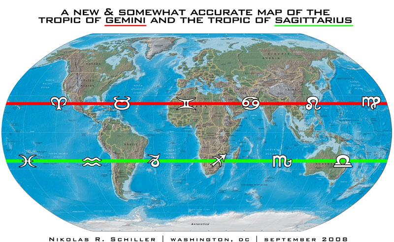
For the last month I’ve been working on a slightly strange map above. It’s based on Johannes van Loon’s “Scenographia systematis mvndani Ptolemaici” (1660), which includes an “Axis Zodiaci” that shows the signs of Gemini and Sagittarius being slightly more illuminated than Cancer & Capricorn (see below). This shading possibly indicates that the author was aware of natural movement of the earth since the time of Ptolemy (~125 A.D.).
A new & somewhat accurate map of the Tropic of Sagittarius and the Tropic of Gemini was created using two maps of the Tropics from Wikipedia. I added the glyphs of the Zodiac over the meridians, but unlike the antique map below, I moved the signs backwards. The word “tropic” itself comes from the Greek tropos, meaning turn, referring to the fact that the sun appears to “turn back” at the solstices. I have read that in 1989 the Tropic of Gemini moved into the constellation of Taurus, which technically means it should be the “Tropic of Taurus,” but to keep the circle of animals in exact opposition, I kept the tropic in Gemini, hence “somewhat accurate.”
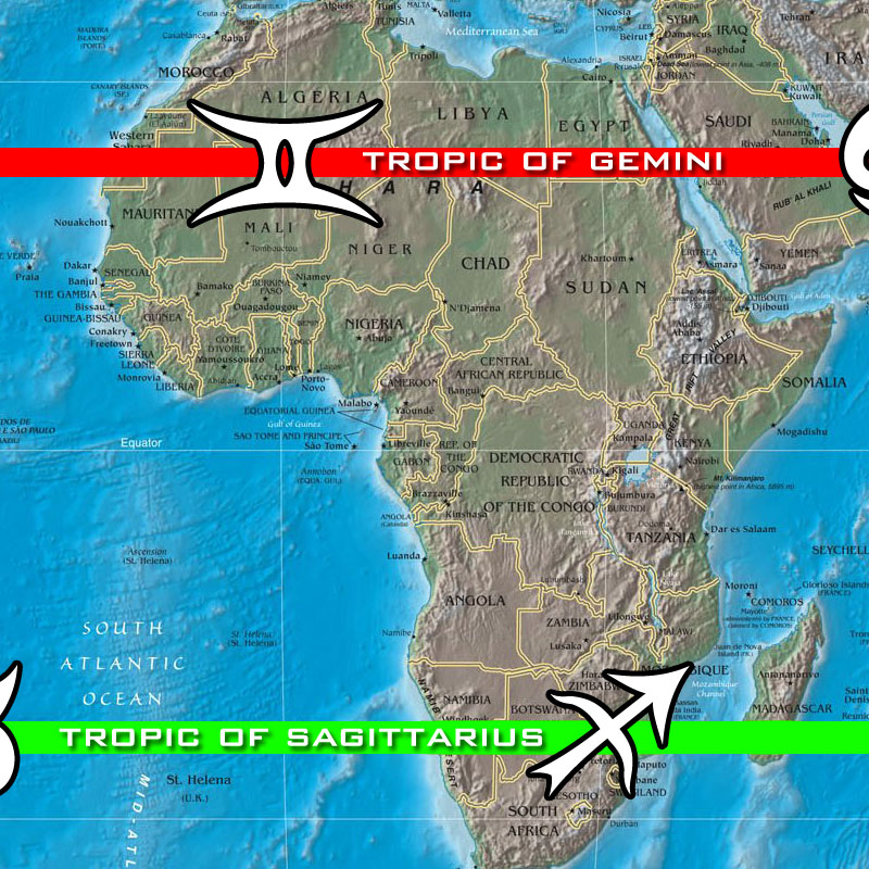
Close-up detail of A New & Somewhat Accurate Map of the Tropic of Gemini and the Tropic of Sagittarius
For hundreds of years cartographers have included the Tropic of Capricorn and the Tropic of Cancer on nearly all globes and world maps. Yet with the natural movement of the earth through space & time, the solstices are not located in the constellations of Capricorn or Cancer anymore. So why do cartographers continue to label the maps & globes using this incorrect information? Does cartographic tradition trump astronomical observation? Should contemporary maps be changed to reflect the passage of time? Are there any antique maps that place the Tropics in any other constellations? Leave your comments below.

Johannes van Loon’s “Scenographia systematis mvndani Ptolemaici” (1660)
Postscript: I believe I was incorrect in my analysis above. I failed to take into account the sideral.
Related Antique Entries:
+ MORE




National MSM of the American Indian on Google Maps; Why truncate the word Museum?
|| 3/31/2008 || 1:55 pm || 1 Comment Rendered || ||
Last night I was using Google Maps and discovered that the label for the National Museum of the American Indian has been truncated to be “National MSM of the American Indian.” This raised alarm because the shorthand for MSM is more recognized as “MainStream Media” not museum. Native Americans have been shortchanged for hundreds of years by the American government, and I found it downright rude that the museum’s name has been cartographically shortchanged as well. So why shorten the name?
+ MORE