Title:Washington Monument Quilt
Size: 10.7″ X 16.0″ (Small)
Material: Somerset Velvet Fine Art
Date of Purchase: 04/01/2009
City: Germantown
State/Province: MD
Country: US
Artwork Commission: $19.29
Framing Commission: $0.00
Commission on this Sale: $19.29
|
Title: Lincoln Memorial Quilt
Size: 10.7″ X 16.0″ (Small)
Material: Enhanced Matte
Date of Purchase: 04/01/2009
City: Germantown
State/Province: MD
Country: US
Artwork Commission: $9.89
Framing Commission: $0.00
Commission on this Sale: $9.89
|
Title: Park La Brea Quilt #3
Size: 6.7″ X 10.0″ (Petite)
Material: Somerset Velvet Fine Art
Date of Purchase: 03/31/2009
City: los angeles
State/Province: CA
Country: US
Artwork Commission: $14.34
Framing Commission: $0.00
Commission on this Sale: $14.34
|
Title: Yankee Stadium Quilt
Size: 16.0″ X 10.7″ (Small)
Material: Hahnemuhle Fine Art Pearl
Date of Purchase: 12/20/2008
City: Washington
State/Province: DC
Country: US
Artwork Commission: $0.00
Framing Commission: $0.00
Commission on this Sale: $0.00
|
Title: GWU Quilt #3
Size: 16.0″ X 24.0″ (Medium)
Material: UltraSmooth Fine Art
Date of Purchase: 12/12/2008
City: Cleveland
State/Province: OH
Country: US
Artwork Commission: $26.22
Framing Commission: $0.00
Commission on this Sale: $26.22
|
Title: Chicago Quilt #3
Size: 21.3″ X 32.0″ (Large)
Material: Somerset Velvet Fine Art
Date of Purchase: 11/16/2008
City: New Paltz
State/Province: NY
Country: US
Artwork Commission: $42.56
Framing Commission: $0.00
Commission on this Sale: $42.56
|
Title: Shirlington Quilt
Size: 48.0″ X 32.0″ (Grande)
Material: Pro Matte Canvas, Gallery Wrapped
Date of Purchase: 10/15/2008
City: Washington
State/Province: DC
Country: US
Artwork Commission: $0.00
Framing Commission: $0.00
Commission on this Sale: $0.00
|
Title: A New & Arabesque Map of the Hirshhorn Museum & Sculpture Garden
Frame: Red Gold Ornate
Mats: Top:Topaz
Glazing: UV protection Acrylic
Size: 25.8″ X 30.3″ (Medium)
Material: Hahnemuhle Fine Art Pearl
Date of Purchase: 09/30/2008
City: Washington
State/Province: DC
Country: US
Artwork Commission: $0.00
Framing Commission: $0.00
Commission on this Sale: $17.61
|
Title: New York Public Library Quilt
Size: 40.0″ X 60.0″ (Massive)
Material: Hahnemuhle Fine Art Pearl
Date of Purchase: 09/16/2008
City: New York
State/Province: NY
Country: US
Artwork Commission: $0.00
Framing Commission: $0.00
Commission on this Sale: $0.00
|
Title: NOVA ET ACCVRATISSIMA TOTIVS TERRARVM ORBIS TABVLA [2008 Remix]
Size: 16.0″ X 21.3″ (Medium)
Material: Enhanced Matte
Date of Purchase: 09/11/2008
City: Loveland
State/Province: CO
Country: US
Artwork Commission: $0.00
Framing Commission: $0.00
Commission on this Sale: $0.00
|
Title: Park La Brea Quilt #3
Size: 40.0″ X 60.0″ (Massive)
Material: Enhanced Matte
Date of Purchase: 06/04/2008
City: New York
State/Province: NY
Country: US
Artwork Commission: $0.00
Framing Commission: $0.00
Commission on this Sale: $0.00
|
Title: Pentagon Quilt #3
Size: 21.3″ X 32.0″ (Large)
Material: Enhanced Matte
Date of Purchase: 04/24/2008
City: Chicago
State/Province: IL
Country: US
Artwork Commission: $0.00
Framing Commission: $0.00
Commission on this Sale: $0.00
|
Title: NOVA ET ACCVRATISSIMA TOTIVS TERRARVM ORBIS TABVLA [2008 Remix]
Frame: Arqadia Gold Carved
Mats: Top:Almond Mid:Porcelain Bot:Almond
Glazing: UV protection Acrylic
Size: 27.5″ X 32.8″ (Medium)
Material: Hahnemuhle Fine Art Pearl
Date of Purchase: 03/07/2008
City: Washington
State/Province: DC
Country: US
Artwork Commission: $0.00
Framing Commission: $29.61
Commission on this Sale: $29.61
|
Title: Washington Monument Quilt
Frame: Florentine Black Loft
Mats: Top:Wheat
Glazing: Non Glare Glass
Size: 18.9″ X 24.3″ (Small)
Material: UltraSmooth Fine Art
Date of Purchase: 02/20/2008
City: McLean
State/Province: VA
Country: US
Artwork Commission: $56.33
Framing Commission: $11.03
Commission on this Sale: $67.37
|
Title: Superdome Quilt – 1st Derivative #2
Size: 48.0″ X 32.0″ (Grande)
Material: Pro Matte Canvas, Gallery Wrapped
Date of Purchase: 02/08/2008
City: Washington
State/Province: DC
Country: US
Artwork Commission: $0.00
Framing Commission: $0.00
Commission on this Sale: $0.00
|
Title: Charlotte Spheres
Size: 32.0″ X 48.0″ (Grande)
Material: Pro Matte Canvas, Gallery Wrapped
Date of Purchase: 02/08/2008
City: Washington
State/Province: DC
Country: US
Artwork Commission: $0.00
Framing Commission: $0.00
Commission on this Sale: $0.00
|
Title: Federal Triangle Quilt #4
Size: 40.0″ X 60.0″ (Massive)
Material: Pro Matte Canvas, not stretched on bars
Date of Purchase: 01/23/2008
City: Washington
State/Province: DC
Country: US
Artwork Commission: $0.00
Framing Commission: $0.00
Commission on this Sale: $0.00
|
Title: Capitol Hill Mandala
Frame: Contemporary Black
Mats: Top:Chalk
Glazing: Non-glare Acrylic
Size: 23.5″ X 23.5″ (Medium)
Material: Enhanced Matte
Date of Purchase: 01/23/2008
City: Washington
State/Province: DC
Country: US
Artwork Commission: $0.00
Framing Commission: $0.00
Commission on this Sale: $11.22
|
Title: Harvard Quilt – NE
Size: 16.0″ X 24.0″ (Medium)
Material: Somerset Velvet Fine Art
Date of Purchase: 12/26/2007
City: Cambridge
State/Province: MA
Country: US
Artwork Commission: $25.73
Framing Commission: $0.00
Commission on this Sale: $25.73
|
Title: Israel / Palestine 1993
Size: 48.0″ X 32.0″ (Grande)
Material: Pro Matte Canvas, Museum Wrap
Date of Purchase: 12/18/2007
City: Washington
State/Province: DC
Country: US
Artwork Commission: $0.00
Framing Commission: $0.00
Commission on this Sale: $0.00
|
Title: Home Quilt #4
Size: 33.0″ X 48.0″ (Grande)
Material: Enhanced Matte
Date of Purchase: 12/17/2007
City: Bethesda
State/Province: MD
Country: US
Artwork Commission: $64.02
Framing Commission: $0.00
Commission on this Sale: $64.02
|
Title: NOVA ET ACCVRATISSIMA TOTIVS TERRARVM ORBIS TABVLA [2007 Remix]
Size: 16.0″ X 21.2″ (Medium)
Material: Pro Matte Canvas, not stretched on bars
Date of Purchase: 12/11/2007
City: Tampa
State/Province: FL
Country: US
Artwork Commission: $0.00
Framing Commission: $0.00
Commission on this Sale: $0.00
|
Title: Sacramento Quilt
Size: 10.7″ X 16.0″ (Small)
Material: Enhanced Matte
Date of Purchase: 12/07/2007
City: Sacramento
State/Province: CA
Country: US
Artwork Commission: $9.89
Framing Commission: $0.00
Commission on this Sale: $9.89
|
Title: Mount Pleasant Quilt
Frame: Wide Square Black
Mats: Top:Matte White
Glazing: Acrylic
Size: 28.8″ X 39.5″ (Large)
Material: Enhanced Matte
Date of Purchase: 12/07/2007
City: Washington
State/Province: DC
Country: US
Artwork Commission: $18.80
Framing Commission: $13.88
Commission on this Sale: $32.68
|
Title: Pittsburgh Quilt
Size: 21.3″ X 32.0″ (Large)
Material: Somerset Velvet Fine Art
Date of Purchase: 11/28/2007
City: Christchurch
State/Province: Canterbury
Country: NZ
Artwork Commission: $42.56
Framing Commission: $0.00
Commission on this Sale: $42.56
|
Title: Central Park Quilt – South
Size: 6.7″ X 10.0″ (Petite)
Material: Enhanced Matte
Date of Purchase: 11/27/2007
City: WASHINGTON
State/Province: DC
Country: US
Artwork Commission: $8.40
Framing Commission: $0.00
Commission on this Sale: $8.40
|
Title: Eastern Market Quilt
Size: 10.7″ X 16.0″ (Small)
Material: Hahnemuhle Fine Art Pearl
Date of Purchase: 11/27/2007
City: WASHINGTON
State/Province: DC
Country: US
Artwork Commission: $23.75
Framing Commission: $0.00
Commission on this Sale: $23.75
|
Title: Lincoln Park Quilt
Size: 10.7″ X 16.0″ (Small)
Material: Enhanced Matte
Date of Purchase: 11/27/2007
City: WASHINGTON
State/Province: DC
Country: US
Artwork Commission: $9.89
Framing Commission: $0.00
Commission on this Sale: $9.89
|
Title: Lincoln Park Quilt #2
Size: 10.7″ X 16.0″ (Small)
Material: Enhanced Matte
Date of Purchase: 11/27/2007
City: WASHINGTON
State/Province: DC
Country: US
Artwork Commission: $9.89
Framing Commission: $0.00
Commission on this Sale: $9.89
|
Title: Lincoln Memorial Quilt
Size: 10.7″ X 16.0″ (Small)
Material: Enhanced Matte
Date of Purchase: 11/15/2007
City: Philadelphia
State/Province: PA
Country: US
Artwork Commission: $9.89
Framing Commission: $0.00
Commission on this Sale: $9.89
|
Title: Egypt Commission
Size: 16.0″ X 16.0″ (Medium)
Material: Hahnemuhle Photo Rag 308
Date of Purchase: 11/07/2007
City: Tampa
State/Province: FL
Country: US
Artwork Commission: $0.00
Framing Commission: $0.00
Commission on this Sale: $0.00
|
Title: Harvard Quilt -NW
Size: 16.0″ X 24.0″ (Medium)
Material: Premium Gloss Canvas, Gallery Wrap
Date of Purchase: 11/06/2007
City: Brooklyn
State/Province: NY
Country: US
Artwork Commission: $89.00
Framing Commission: $0.00
Commission on this Sale: $89.00
|
Title: Pentagon Quilt #3
Frame: Neo Black Slope
Mats: Top:Charcoal
Glazing: Acrylic
Size: 24.3″ X 32.3″ (Medium)
Material: Enhanced Matte
Date of Purchase: 10/26/2007
City: Washington
State/Province: DC
Country: US
Artwork Commission: $25.21
Framing Commission: $12.39
Commission on this Sale: $37.60
|
Title: Union Station Quilt #2
Frame: Neo Black Slope
Mats: Top:Granite
Glazing: Acrylic
Size: 24.3″ X 32.3″ (Medium)
Material: Enhanced Matte
Date of Purchase: 10/26/2007
City: Washington
State/Province: DC
Country: US
Artwork Commission: $12.86
Framing Commission: $12.39
Commission on this Sale: $25.25
|
Title: Dupont Circle Quilt
Size: 16.0″ X 24.0″ (Medium)
Material: Somerset Velvet Fine Art
Date of Purchase: 10/24/2007
City: Falls Church
State/Province: VA
Country: US
Artwork Commission: $25.73
Framing Commission: $0.00
Commission on this Sale: $25.73
|
Title: UCLA Quilt w/ Engraving
Size: 48.0″ X 32.0″ (Grande)
Material: Enhanced Matte
Date of Purchase: 10/08/2007
City: Los Angeles
State/Province: CA
Country: US
Artwork Commission: $0.00
Framing Commission: $0.00
Commission on this Sale: $0.00
|
Title: Pittsburgh Quilt #3
Size: 16.0″ X 24.0″ (Medium)
Material: Enhanced Matte
Date of Purchase: 07/11/2007
City: Hermitage
State/Province: PA
Country: US
Artwork Commission: $12.86
Framing Commission: $0.00
Commission on this Sale: $12.86
|
Title: Superdome Quilt
Size: 24.0″ X 16.0″ (Medium)
Material: Enhanced Matte
Date of Purchase: 07/11/2007
City: Hermitage
State/Province: PA
Country: US
Artwork Commission: $12.86
Framing Commission: $0.00
Commission on this Sale: $12.86
|
Title: Queen Anne Quilt
Size: 32.0″ X 48.0″ (Grande)
Material: Enhanced Matte
Date of Purchase: 06/29/2007
City: Washington
State/Province: DC
Country: US
Artwork Commission: $0.00
Framing Commission: $0.00
Commission on this Sale: $0.00
|
Title: Pittsburgh Quilt #3
Size: 16.0″ X 24.0″ (Medium)
Material: Somerset Velvet Fine Art
Date of Purchase: 06/12/2007
City: Pittsburgh
State/Province: PA
Country: US
Artwork Commission: $25.73
Framing Commission: $0.00
Commission on this Sale: $25.73
|
Title: Catholic University Quilt #2
Size: 6.7″ X 10.0″ (Petite)
Material: Hahnemuhle Fine Art Pearl
Date of Purchase: 05/14/2007
City: Washington
State/Province: DC
Country: US
Artwork Commission: $16.32
Framing Commission: $0.00
Commission on this Sale: $16.32
|
Title: Georgetown University Quilt
Size: 6.7″ X 10.0″ (Petite)
Material: Hahnemuhle Fine Art Pearl
Date of Purchase: 05/14/2007
City: Washington
State/Province: DC
Country: US
Artwork Commission: $16.32
Framing Commission: $0.00
Commission on this Sale: $16.32
|
Title: Eastern Market Quilt
Size: 21.3″ X 32.0″ (Large)
Material: Somerset Velvet Fine Art
Date of Purchase: 04/30/2007
City: Washington
State/Province: DC
Country: US
Artwork Commission: $42.56
Framing Commission: $0.00
Commission on this Sale: $42.56
|
Title: Washington Monument Quilt
Frame: Wide Square Black
Mats: Top:Meringue
Glazing: Acrylic
Size: 18.2″ X 23.5″ (Small)
Material: Somerset Velvet Fine Art
Date of Purchase: 04/30/2007
City: Arlington
State/Province: VA
Country: US
Artwork Commission: $19.29
Framing Commission: $6.76
Commission on this Sale: $26.05
|
Title: Georgetown University Quilt
Size: 16.0″ X 24.0″ (Medium)
Material: Enhanced Matte
Date of Purchase: 03/18/2007
City: Washington
State/Province: DC
Country: US
Artwork Commission: $12.86
Framing Commission: $0.00
Commission on this Sale: $12.86
|
Title: RFK Quilt
Size: 33.0″ X 48.0″ (Grande)
Material: Enhanced Matte
Date of Purchase: 03/16/2007
City: Washington
State/Province: DC
Country: US
Artwork Commission: $16.82
Framing Commission: $0.00
Commission on this Sale: $16.82
|
Title: GWU Quilt #4
Size: 21.3″ X 32.0″ (Large)
Material: Enhanced Matte
Date of Purchase: 03/15/2007
City: Fairfax
State/Province: VA
Country: US
Artwork Commission: $18.80
Framing Commission: $0.00
Commission on this Sale: $18.80
|
Title: Seattle Quilt #2
Size: 10.7″ X 16.0″ (Small)
Material: Premium Photo Luster
Date of Purchase: 03/15/2007
City: Bothell
State/Province: WA
Country: US
Artwork Commission: $13.35
Framing Commission: $0.00
Commission on this Sale: $13.35
|
Title: C.I.A. Quilt #2
Size: 21.3″ X 32.0″ (Large)
Material: Somerset Velvet Fine Art
Date of Purchase: 03/15/2007
City: Falls Church
State/Province: VA
Country: US
Artwork Commission: $42.56
Framing Commission: $0.00
Commission on this Sale: $42.56
|
Title: Eastern Market Quilt
Size: 10.7″ X 16.0″ (Small)
Material: Somerset Velvet Fine Art
Date of Purchase: 03/14/2007
City: Washington
State/Province: DC
Country: US
Artwork Commission: $19.29
Framing Commission: $0.00
Commission on this Sale: $19.29
|
Title: Woodley Park Quilt
Size: 10.7″ X 16.0″ (Small)
Material: Enhanced Matte
Date of Purchase: 03/14/2007
City: Washington
State/Province: DC
Country: US
Artwork Commission: $9.89
Framing Commission: $0.00
Commission on this Sale: $9.89
|
Title: Denver Quilt #2
Size: 10.7″ X 16.0″ (Small)
Material: Somerset Velvet Fine Art
Date of Purchase: 03/14/2007
City: Washington
State/Province: DC
Country: US
Artwork Commission: $19.29
Framing Commission: $0.00
Commission on this Sale: $19.29
|
Title: Houston Quilt
Size: 10.7″ X 16.0″ (Small)
Material: Somerset Velvet Fine Art
Date of Purchase: 03/14/2007
City: Washington
State/Province: DC
Country: US
Artwork Commission: $19.29
Framing Commission: $0.00
Commission on this Sale: $19.29
|
Title: American University Quilt #2
Size: 6.7″ X 10.0″ (Petite)
Material: Enhanced Matte
Date of Purchase: 03/14/2007
City: Washington
State/Province: DC
Country: US
Artwork Commission: $8.40
Framing Commission: $0.00
Commission on this Sale: $8.40
|
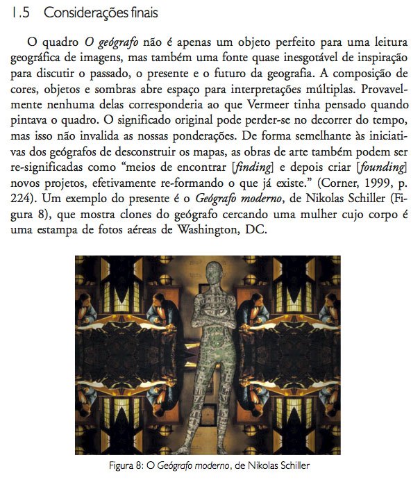
Title: The Modern Geographer
Size: 16.0″ X 21.3″ (Medium)
Material: Enhanced Matte
Date of Purchase: 03/14/2007
City: Annapolis
State/Province: MD
Country: US
Artwork Commission: $12.86
Framing Commission: $0.00
Commission on this Sale: $12.86
|
Title: Catholic University Quilt
Size: 16.0″ X 24.0″ (Medium)
Material: Enhanced Matte
Date of Purchase: 03/14/2007
City: Annapolis
State/Province: MD
Country: US
Artwork Commission: $12.86
Framing Commission: $0.00
Commission on this Sale: $12.86
|


Map Mashup: Healthcare Heartburn
|| 3/23/2010 || 5:39 pm || 1 Comment Rendered || ||
Above is Amy Martin’s “Keep America Healthy – Public Option Please” with a map of the average federal revenue per capita by state in 2007 superimposed. At over $34,000 per citizen, the District of Columbia pays the more any jurisdiction in America, yet the 600,000 citizens have no representation in Congress….
Ironically related is my entry on Hartburn, DC.